
When I bought my first Bambu printer I had a very clear and entirely delusional plan for filament. I would buy a few sensible colours, keep things tidy, and not become one of those people with shelves of spools that were clearly getting out of hand. Black, white, red, blue. Four colours. That would be enough.
It was not enough. It was never going to be enough. Within a few months I had green because I needed it for a specific print, then yellow because the green was useless without yellow, then orange because the project after that needed it. Then a lighter red because the original red was wrong for something. Then a darker blue. Then grey — one grey, which immediately made me aware that there are at least five meaningfully different greys and I had the wrong one. Then a second grey. Then a silk gold because it looked incredible and a model specifically called for it. Then a matte black because the standard black was too glossy for a particular functional part.
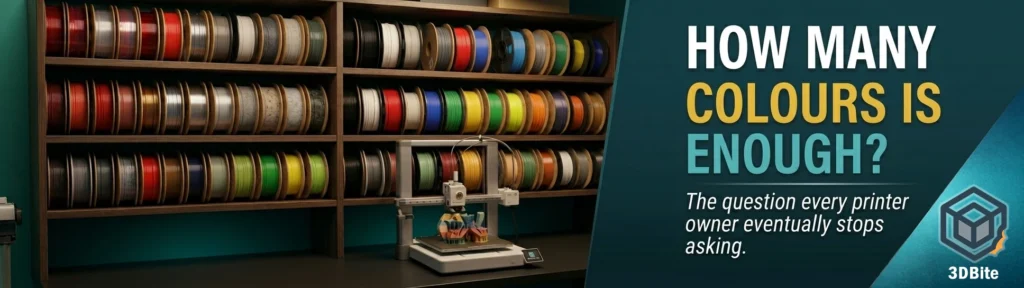
I currently have over 40 spools. I am aware that I could double that without much difficulty if I relaxed my self-imposed discipline about not buying anything I cannot specifically justify. The discipline is imperfect but it is the only thing standing between me and a dedicated storage room.
This post is about how that happens, why it is both reasonable and slightly out of control, and what a more considered approach might look like if you are earlier in the process than I was.
The starter set illusion
The idea that a handful of colours will suffice makes intuitive sense when you first start printing. Most people come from a background where they think about filament the way they think about paint: you buy a few basic colours and mix what you need. The difference is that you cannot mix filament. What is in the spool is what comes out of the nozzle. There is no combining cyan and yellow on the fly to get green. If you need green, you need a green spool.
This is the first and most fundamental reason the collection grows. The scope of what you want to print expands, and each new project adds at least one colour requirement that your existing inventory cannot meet. It is not indiscipline. It is the logical consequence of printing a wider range of things. The person who only ever prints functional parts in black and grey can absolutely get away with two spools. The person printing seasonal gifts, figurines, display models, and household projects across a year will run into colour gaps constantly.
The honest answer to the question in the title of this post is: enough is however many colours your specific printing habits require. Which is not a satisfying answer, so let us be more specific about how those habits actually develop and what the collection typically looks like at each stage.
Stage one: the obvious colours
Most new printer owners start with the same instincts. Black and white are the obvious choices — black for functional parts, white as a neutral base for painted finishes or clean-looking models. Red and blue follow because they are primary colours and feel like foundational inventory. Some people start with grey instead of or alongside white, on the grounds that grey is more versatile for functional parts that are not going to be painted.
This starter set lasts until the first project that needs a colour it does not contain. For most people, that project arrives within the first few weeks. A plant label that should be green. A fidget toy that needs yellow. A child’s toy that specifically requires orange. The obvious colours are a reasonable place to start, but they cover less of the practical colour space than they seem to when you are looking at them in a shop.
A more considered starter set for a new printer owner who intends to print a variety of things might look like this:
- Black — functional parts, brackets, structural items, anything that should look technical
- White — neutral base, clean aesthetic, indoor display pieces
- Grey — mid-tone functional items, less stark than black, more interesting than white
- Red — broadly useful, covers most warm-tone requirements at the start
- Blue — covers most cool-tone requirements initially
- Green — more universally needed than people expect. Nature-themed prints, garden items, gaming pieces
- Yellow — needed far more often than anticipated, especially for anything involving sunlight, fruits, or bright accents
Seven colours. That is a more honest starter set than the four-spool instinct most people act on. If you are new and you want to avoid the frustration of missing a colour on every other project, starting with seven covers the primary and secondary colour space adequately and gives you a working range before the collection grows organically.
Stage two: the shades problem
Once you have the basic colour set, the next phase of collection expansion is driven by something more subtle: the realisation that a colour is not a single thing. Red is not a single colour. It is a spectrum from brick red to fire engine red to crimson to salmon, and each of those occupies a different visual space and suits a different type of model.
This hits differently depending on what you print. For purely functional parts where colour is incidental, one red is fine. For anything where the colour is part of the visual intention — a gift, a display piece, a model that has to match something — the wrong shade is immediately obvious and the right shade is not what you have. My original red was a standard primary red that worked well for bold, graphic models and nothing else. The Mario and Luigi prints I did for my godson required a very specific shade — not the primary red, not orange-red, but the particular vermillion that reads as Mario red. That required a different spool entirely.
The shades problem compounds with blues especially. A navy blue and a sky blue are so different in character that they do not really serve as substitutes for each other. Teal is its own thing. Cobalt is different again. Most collections end up with three or four blues before long, not because the person collecting them lacks discipline but because blues genuinely occupy meaningfully different visual and aesthetic spaces depending on shade.
The same is true for greens, greys, browns, and to a lesser extent reds and oranges. Each new shade is justified by a specific project that the existing shade could not serve. The collection expands not all at once but one spool at a time, each addition entirely reasonable in isolation, collectively producing a substantial inventory.
Stage three: the finishes
Standard PLA in the primary colours is stage one. By the time you start thinking about finishes, you are firmly in stage three and the collection expansion accelerates significantly.
Matte filaments are the first finish upgrade most people reach for. Standard PLA has a slightly glossy surface that catches light and shows layer lines clearly. Matte PLA absorbs light rather than reflecting it, conceals layer lines more effectively, and produces a surface that looks more engineered and less plastic. Once you have printed something in matte black alongside something in standard black, the difference is obvious enough that you want matte versions of your most-used colours. That is immediately several more spools.
Silk filaments follow. The metallic sheen that silk PLA produces is genuinely striking and completely unlike standard PLA. A silk gold or silk copper figurine looks like it has been cast in metal. A silk galaxy purple catches light from every angle. These are not colours you can replicate with standard filaments. Once you have seen the difference on a print, the standard version of the same colour feels like a downgrade for anything display-facing. Silk gold, silk silver, silk copper, silk rainbow — each of these is a spool that does something no other spool in the collection can do.
Then there are the specialty materials: carbon fibre PLA for structural black parts with a professional matte texture, transparent and translucent colours for light-diffusing effects, glow in the dark for obvious reasons, wood-fill and marble-fill for surface texture effects. Each of these is a single specific capability that nothing else in the collection replicates. Each one is easy to justify and each one adds to the total spool count.
Stage four: the seasonal creep
Christmas is the single biggest driver of collection expansion for many hobbyists, and I say this from direct experience. Seasonal printing introduces colour requirements that are highly specific and largely useless outside of a six-week window. A particular deep burgundy for a festive lamppost. A translucent red for a light-up nose on Rudolph that still needs a better profile and a reprint — which will require buying a different translucent red. A candy cane red-and-white combination. Warm cream for a gingerbread-aesthetic print. Forest green for Christmas tree models that looks different from the general-purpose bright green you already have.
Seasonal projects are also the category most likely to produce a spool you buy specifically for one job and then put on the shelf for eleven months. This is an important thing to be honest with yourself about before buying. A colour you need for one specific seasonal project is a legitimate purchase if you are confident you will use it again next year. It is worth pausing before buying if you are really buying it for a single print and have no plan for the rest of the spool.
The storage reality
A standard 1kg spool of PLA is approximately 200mm in diameter and 70mm wide. Forty spools stacked or racked takes up meaningful shelf space. The practical constraint is real — filament needs to be stored in a way that keeps it dry and organised, accessible when you need a specific colour without excavating a pile, and visually identifiable without reading the label on every spool.
The storage problem is what enforces discipline more effectively than any amount of good intentions. Once you have run out of shelf space, adding another spool requires adding more storage or removing something that is there already. Most people hit this constraint before they hit any personal philosophical limit about how many spools is too many. It is worth thinking about your storage capacity before the collection grows rather than retrofitting storage solutions after the fact.
Practically: a IKEA KALLAX unit holds approximately eight to ten spools per shelf section, depending on spool diameter. A dedicated dry storage cabinet with individual spool drawers is the organised end of the spectrum. The middle ground is sealed boxes with desiccant packets, labelled by colour family, stored somewhere accessible to the printer. Whatever the solution, plan for more capacity than you think you need. The collection will grow toward whatever capacity is available.
What actually gets used
Across a large collection, usage is highly uneven. In my own experience, roughly five to eight colours account for the majority of print volume. Black and white are always high usage — they appear in functional parts, base layers, and support roles even on colour prints. My primary PLA+ colour — eSun grey-green or natural depending on the project — goes through spools faster than anything else. The seasonal and specialty colours sit largely unused between specific projects.
This is worth knowing before the collection grows, because it suggests a two-tier approach: a core group of high-use colours that you buy in volume and restock regularly, and a secondary group of specialty and seasonal colours that you buy as needed and store carefully. The secondary tier grows over time as specific projects justify specific purchases. The core tier stays relatively stable once established.
Advice for new printer owners
If you are in the early stages of building a filament collection, here is what I would tell myself if I were starting again with the benefit of hindsight.
Start with seven colours rather than four. Black, white, grey, red, blue, green, yellow covers the primary and secondary colour space without gaps that will frustrate you on every second project. Buy the best quality you can in these core colours — this is where eSun PLA+ earns its place as the daily material across the whole range. Consistent quality across your most-used colours matters more than variety in the early stages.
Add your first silk colour as soon as you can justify it. Even one silk spool — gold is the most versatile starting point — will show you what the finish is capable of and inform your judgement about whether it is worth expanding the silk range. Once you have seen a silk gold print in good lighting, you understand why the category exists.
Buy a matte black early. The difference between standard black and matte black on functional or technical-looking prints is immediate and hard to unsee once you have noticed it. Matte black becomes a regular rotation colour for a large proportion of functional work.
Resist buying specialty colours on impulse until you have a specific project that justifies them. Translucent red sitting on a shelf for six months waiting for the right print is a common outcome of impulse buying. The colour will still exist when you need it. The shelf space and the money are better saved until the project materialises.
Accept early that the collection will grow. Fighting that growth entirely is a losing battle if you are an active printer who works across a variety of project types. The practical approach is not to prevent growth but to manage it — buy deliberately, store properly, and make sure the specialty and seasonal spools you buy have a realistic plan for being used before the next restock impulse arrives.
A reasonable working collection
For context: here is what a well-rounded working collection might look like for someone who prints functional parts, display pieces, and occasional gifts across the year, without going overboard.
| Colour category | Suggested spools | Notes |
|---|---|---|
| Black | 2 — standard + matte | Standard for AMS multi-colour work. Matte for functional standalone parts |
| White | 1–2 | Standard white for most uses. Silk white optional if you print display pieces |
| Greys | 2 — mid grey + dark grey | More versatile than having one grey that sits in the wrong part of the spectrum |
| Reds | 2 — primary red + a deeper red | Primary red for bold models. Darker red for seasonal and display work |
| Blues | 2–3 — primary blue + navy + optional teal | Blues vary significantly in character. Two covers most bases |
| Greens | 2 — bright green + forest green | Bright for plants and gaming. Dark for seasonal and nature prints |
| Yellow | 1 | One good yellow covers most requirements |
| Orange | 1 | Used less than expected but needed when it is needed |
| Brown | 1 | More useful than its reputation — wood effect, earthy tones, gaming models |
| Silk range | 2–4 | Gold and silver as starters. Add copper and a colour silk as the range grows |
| Matte range | 2–3 | Matte black essential. Matte grey and matte white useful for a polished finish |
| Transparent/translucent | 1–2 | Clear or lightly tinted. Useful for light diffusing objects and indicators |
| Specialty (CF, glow, wood) | As needed | Buy to a specific project rather than stocking speculatively |
That is 20–25 spools for a well-rounded general collection. It feels like a lot when you are starting out. It feels like barely enough when you are deep in the hobby. Both of those things are true simultaneously, which tells you something important about the nature of the collection-building process.
The number that is actually enough
There is no universally correct answer to how many filament colours is enough, because enough is defined by what you print. A functional-only printer with no interest in display pieces or colour variety can operate indefinitely on five or six spools. An active hobbyist who prints across a range of categories will find that 20–30 spools covers most situations with minimal gaps. Someone who prints seasonal, themed, and specialty content regularly will find that 40 is reasonable and 60 is not unreasonable.
What I can tell you from experience is that the number you think will be enough at the start is always less than what you actually end up with. That is not a character flaw or a lack of discipline — it is the natural consequence of using a tool that rewards having the right material available when a project needs it. The collection grows because printing grows, and that is a reasonable outcome.
The practical discipline is not in limiting the collection to an arbitrary number. It is in buying deliberately rather than speculatively, storing properly so the collection is accessible rather than chaotic, and being honest with yourself about whether a specific shade is genuinely justified by something you plan to print in the near future or whether it is an impulse that will sit on a shelf gathering dust.
I am still working on that last part.
I am curious where other people land on this. Where did you start, where are you now, and what was the purchase that made you realise the starter set was never going to hold? Is there a colour you bought speculatively and never used? A shade you wish you had bought sooner? Drop a comment below — this is one of those topics where the community’s collective experience tells a more honest story than any single person’s collection. I would genuinely like to know whether 40 spools is considered modest or excessive in your setup.